Diamond & Pearl Stormfront — The 18 Cards With the Lowest PSA Populations
May 20, 2026
Diamond & Pearl Stormfront released in November 2008 as one of the final sets in the DP era. It's best known for the Secret Rare Charmander, Charmeleon, Charizard lineup, but beneath those headlines is a collection of reverse foils and mid-evolution commons that almost never find their way into PSA slabs.
The 18 cards listed here have the lowest recorded PSA populations in the English set, with each having a total population of 1. Some are low because they're commons nobody bothers to grade. Others are low because of their reverse holofoil that are almost impossible for players of the game to keep in good shape, especially when it comes to grading.
One detail worth emphasizing is that every card on here has exactly one copy graded with PSA. A population of 1 doesn't mean that copy is a PSA 10, or really any grade. So the single graded example of any card on this list could be a PSA 1 sitting in someone's collection. That makes these cards even harder to collect.
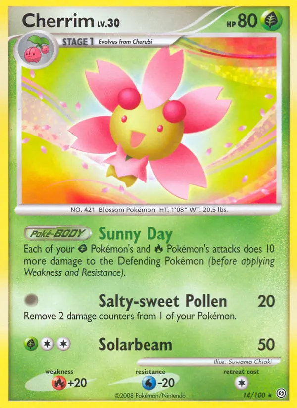
Cherrim #14 — Stormfront reverse foil
#14 Cherrim (Reverse Foil)
Midori Harada's artwork shows Cherrim locked in its Sunshine Form — petals fanned wide, the background flooded with warm golden light. It's one of the brighter, more optimistic pieces in a set that leans heavily on dark and ghostly Pokémon. The reverse foil treatment layers a fine shimmer across that already-warm palette, which sounds appealing in theory, but in practice the foiling process on DP-era uncommons frequently leaves the surface prone to scratching and print lines. A reverse foil uncommon with a light background shows every handling mark, which is part of why so few come back from PSA with grades worth keeping. Nobody was submitting it, and even if they had, clean copies were hard to find.
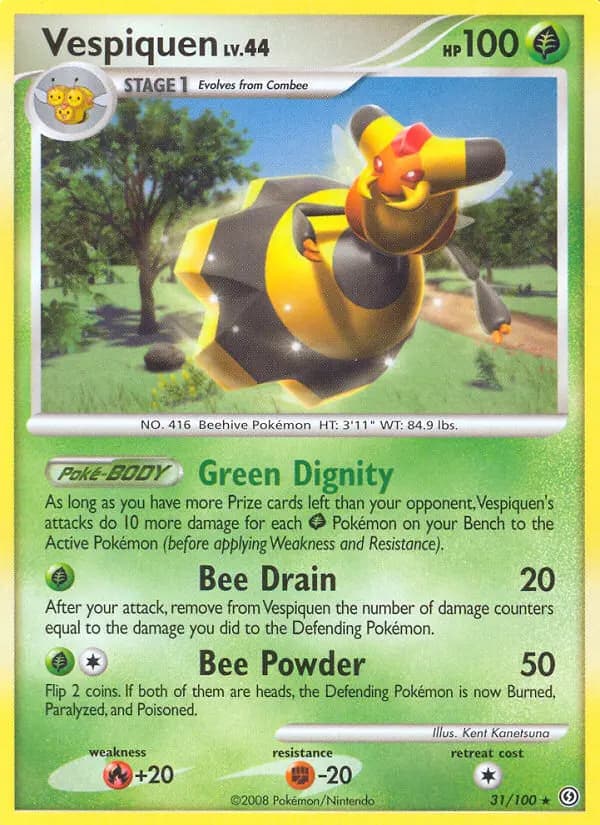
Vespiquen #31 — Stormfront
#31 Vespiquen
Kouki Saitou's artwork gives Vespiquen a genuinely commanding presence — she fills the frame front and center, wings slightly spread, honeycomb geometry tiling the background in deep amber and gold. It's a strong composition for a Stage 1 that often gets lost in the middle of the set. The card stock on DP-era Stage 1s tends to show edge wear quickly, and because Vespiquen carries no collector premium, copies that came out of packs went straight into binders or bulk boxes without anyone thinking twice about condition. There was never a financial incentive to sleeve it carefully, and that casual handling history is exactly why the census is almost empty.
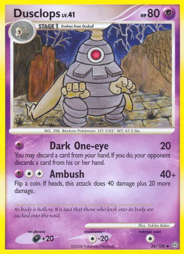
Dusclops #34 — Stormfront
#34 Dusclops
Midori Harada leans into Dusclops' ghost-type identity fully here — the card is almost entirely dark background, with Dusclops' single cyclopean eye glowing at the center like a pale lantern in a void. The bandaged, hollow body fades into shadow at the edges. It's one of the moodier pieces in the set and visually distinctive in a way that makes it stand out in a binder. The problem for grading is what that dark background reveals: any surface scratch, print defect, or indent from mishandling shows up immediately against the black. Dark backgrounds are unforgiving at PSA, and a Stage 1 mid-evolution with no particular collector demand is never going to get the white-glove treatment it would need to come back a 10.
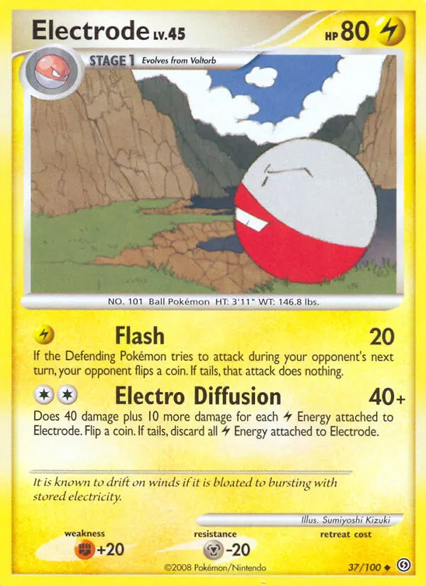
Electrode #37 — Stormfront
#37 Electrode
Atsuko Nishida illustrates Electrode mid-charge — the round body framed by jagged electric arcs crackling outward against a deep blue-black background. It's a clean, kinetic image that captures the tension of a Pokémon that's basically a living bomb. As a common, Electrode came out of every pack that contained it, got shuffled into bulk without ceremony, and was never treated as a card worth protecting. Commons from late DP sets accumulate handling damage fast: corner dents from loose storage, surface scratching from card-on-card friction in bulk boxes, and print quality that was already inconsistent at the factory. The census being almost empty isn't surprising — it's the default outcome for any common that nobody had a reason to sleeve.
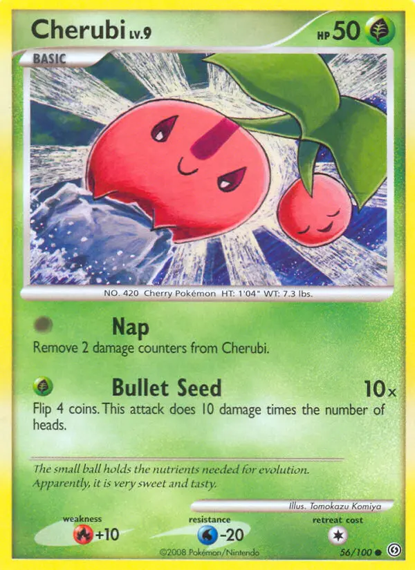
Cherubi #56 — Stormfront
#56 Cherubi
Atsuko Nishida draws Cherubi small and round against a soft, pastel-green meadow background — two cherry-red spheres connected at the stem, its tiny face squinting cheerfully in the sun. It's a gentle, unassuming illustration that fits the Pokémon exactly. The light background and bright red coloring means any yellowing, print dot imperfections, or surface scratches read clearly under grading examination. Cherubi is the kind of card that comes out of a pack, gets looked at for half a second, and goes into a bulk pile. The combination of no collector demand, a pale background that highlights flaws, and the total absence of any reason to handle it carefully all push the population toward zero.
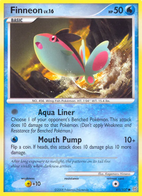
Finneon #61 — Stormfront
#61 Finneon
Masakazu Fukuda's illustration is one of the more visually striking pieces among Stormfront's commons — Finneon is rendered with translucent, bioluminescent fins that glow pink and violet against an deep underwater blue-green backdrop. The fins catch the light in a way that gives the card real visual depth for a Basic. That vivid coloring, however, is precisely what makes the card unforgiving to grade: any surface scratching on the fins or background bleeds through immediately, and the DP-era card stock didn't do Finneon any favors. It's a card with better artwork than its census suggests, buried at the bottom of a set nobody was mining for Water-type commons.
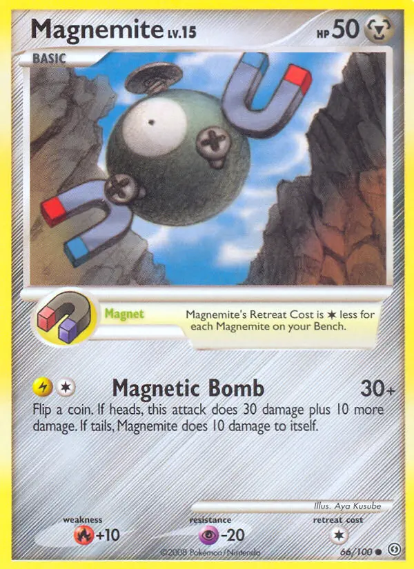
Magnemite lv.15 #66 — Stormfront reverse foil (Metal type)
#66 Magnemite lv.15 — Metal Type (Reverse Foil)
Aya Kusube's illustration places Magnemite in a sharp, high-contrast industrial setting — the metallic body catches cool blue-grey light, its three screws and single eye rendered with clean precision. The reverse foil treatment adds a layer of shimmer to that already metallic background, which creates an interesting visual effect but is a grading liability: the foiling on DP-era commons sits unevenly over the printed surface, and the metallic background makes any bubbling, clouding, or foil separation visually obvious. The bigger issue is the two-Magnemite situation in Stormfront — most collectors don't realize there are two distinct cards at #66 and #67 until they go looking, so one or both regularly get filed away without recognition. The reverse foil version of this specific variant almost never makes it into a submission batch.
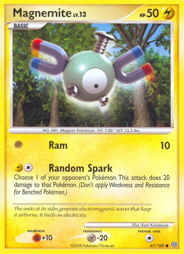
Magnemite lv.13 #67 — Stormfront reverse foil (Lightning type)
#67 Magnemite lv.13 — Lightning Type (Reverse Foil)
Kent Kanetsuna's take on Magnemite differs subtly but meaningfully from Aya Kusube's version at #66 — the color temperature here runs warmer and the background carries more yellow-gold tones, reflecting the Lightning typing. The composition is similar: Magnemite centered, screws and eye precisely rendered, but the lighting gives the card a distinctly different mood. Side by side the two cards read as variations on a theme rather than duplicates, but in isolation most people can't identify which one they're holding. That confusion is part of what depresses the census — collectors who know they need the reverse foil Magnemite frequently complete their checklist with only one of the two variants without realizing. The reverse foil treatment carries the same condition risk as its counterpart: foil inconsistency over a metallic background shows every flaw.
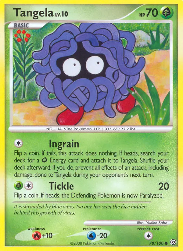
Tangela #78 — Stormfront
#78 Tangela
Midori Harada leans into Tangela's defining visual trait — the entire card is consumed by dense, intertwining blue-green vines, with only those two small red eyes visible through the mass of tendrils. The background is deep forest shadow, giving the image a slightly mysterious quality. The all-over vine texture is visually interesting but creates a grading challenge: the dense linework across the whole illustration surface means any print dot irregularity or surface scratch registers immediately. It's also a card that nobody was thinking about from a condition standpoint. Tangela came out of packs, went into binders or bulk, and the idea of submitting one to PSA simply never crossed most people's minds. The census reflects that complete absence of collector attention.
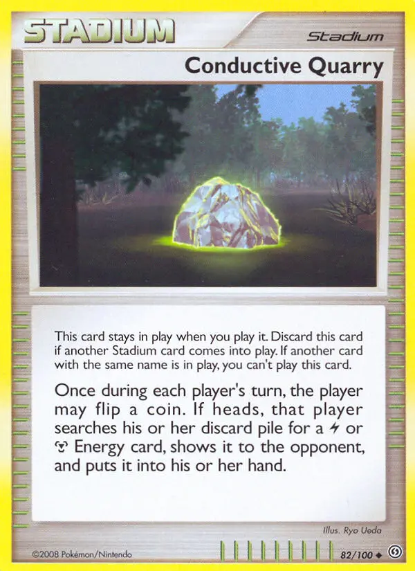
Conductive Quarry #82 — Stormfront reverse foil stadium
#82 Conductive Quarry — Stadium (Reverse Foil)
Ryo Ueda's illustration gives Conductive Quarry an almost architectural quality — a high-tech industrial facility rendered in clean lines and cool grays, with mechanical structures and electrical conduits framing the composition. The reverse foil treatment adds shimmer to the already-steel-toned background, layering metallic over metallic. Stadium cards as a category are among the least-graded in any set: they're treated as utility items, shuffled into deck boxes and sleeves without consideration for condition, and the wide flat background on most stadium illustrations exposes every nick and surface mark. Reverse foil stadiums are particularly fragile because the foil layer over a large uniform background area is where separation and clouding tend to show up first. Very few ever come back clean.
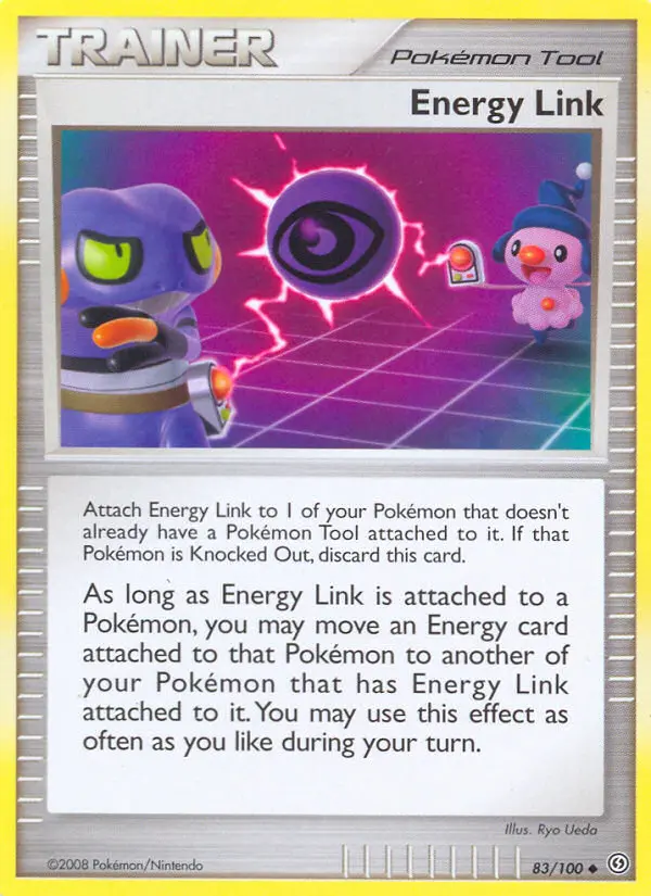
Energy Link #83 — Stormfront Pokémon Tool
#83 Energy Link — Pokémon Tool
Ryo Ueda takes a minimalist approach here — the artwork is sparse and clean, abstract light trails forming a connection between two focal points against a soft neutral background. It's a functional illustration in the truest sense: designed to communicate the card's effect visually rather than to show a Pokémon or scene. That design choice, combined with the tool card format, means Energy Link reads as a utility object rather than a collectible. Tool cards from the DP era were pulled out of packs and put directly into decks, where they accumulated sleeve wear, surface friction, and corner stress over the course of months of play. No one was setting aside a mint copy. The bland visual and pure utility status are exactly the conditions that produce a near-empty census.
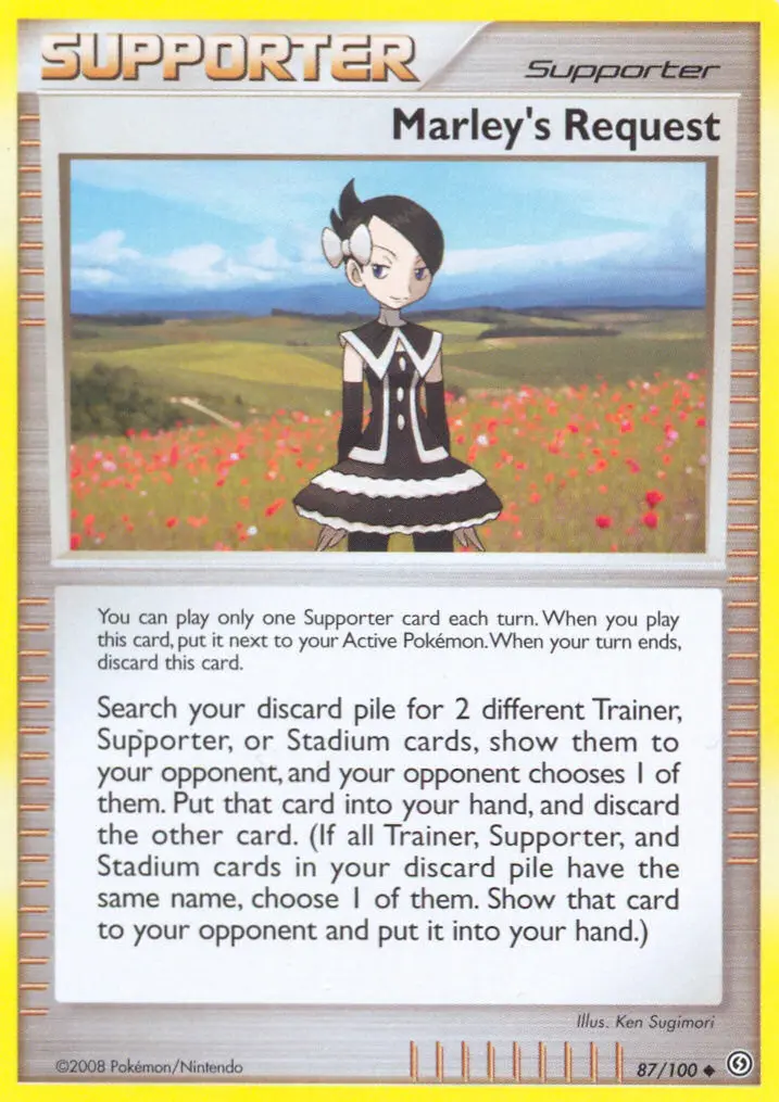
Marley's Request #87 — Stormfront reverse foil supporter
#87 Marley's Request — Supporter (Reverse Foil)
Yuka Morii's clay-figure illustration style gives Marley an almost sculptural three-dimensionality that stands apart from every other card in the set. Morii photographs hand-crafted clay figures rather than drawing digitally or traditionally, and the result has a tactile, tangible quality — Marley's dark hooded cloak, downcast expression, and Arcanine by her side all rendered with that characteristic soft-focus depth. It's one of the most visually distinctive Supporter cards in the entire DP era. The reverse foil treatment adds a layer of shimmer across that already textured surface, which sounds like it should enhance the card but in practice creates a tension: the foil layer sits on top of an illustration designed to look three-dimensional and soft, and any imperfection in the foil application — bubbling, scratching, uneven coverage — clashes with the delicate clay texture underneath. That combination of complex surface and reverse foil treatment makes near-mint copies genuinely rare to find, and the PSA census confirms it.
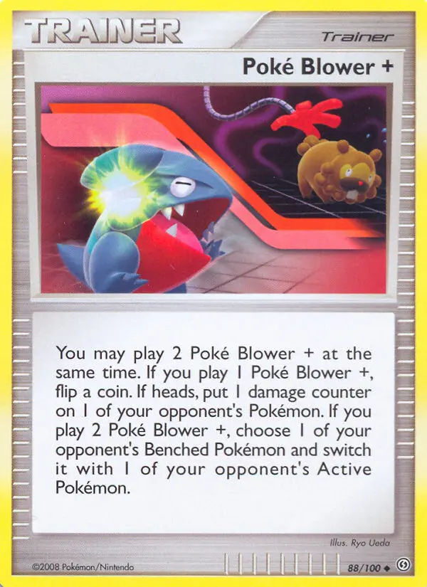
Poké Blower+ #88 — Stormfront
#88 Poké Blower+
Ryo Ueda's illustration depicts what appears to be a futuristic blower device — sleek, mechanical, emitting a directed energy burst in cool blue-white tones against a dark background. The artwork has the same clean, technical aesthetic shared by the other Poké+ trainer cards, forming a visual family across the set. As a trainer card, Poké Blower+ lived in deck boxes and saw constant in-game use. The dark background on the illustration means surface scratches and white corner stress show up sharply against it, but that's almost a moot point — this is the category of card that went from pack to deck to donation pile without a single person considering its condition. Common trainer cards are the most handled, least preserved objects in any set, and the census reflects that completely.
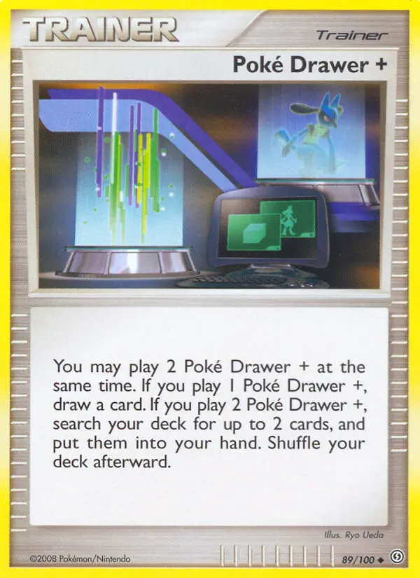
Poké Drawer+ #89 — Stormfront reverse foil
#89 Poké Drawer+ (Reverse Foil)
Ryo Ueda places a Lucario silhouette in the background of this one — a dark, imposing figure visible through what appears to be a high-tech interface display or scanning chamber. The composition has more visual depth than most trainer illustrations from the era: the foreground shows the Poké Drawer device itself, and the background carries a soft blue-lit environment with Lucario's form adding a character presence that elevates the card beyond pure abstraction. The reverse foil treatment runs across that blue-toned background, and the foil layer on a card this widely used is almost never in clean condition — reverse foil trainers from Stormfront that saw actual play come back with foil wear and surface scratching that rules out high grades. The ones that stayed pristine are the ones nobody played, and very few copies were set aside.
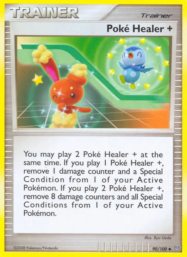
Poké Healer+ #90 — Stormfront
#90 Poké Healer+
Ryo Ueda's illustration is one of the warmest and most cheerful pieces in the entire set — Buneary and Piplup bathed together in soft, sparkly golden healing light, their expressions calm and content. Against the cool-toned darkness and ghostly imagery that dominates much of Stormfront's card art, Poké Healer+ reads almost like a palette cleanser. The golden light and warm tones give it an inviting quality. That light background, however, is a condition liability: any yellowing of the card stock, print irregularity, or surface imperfection shows clearly against the soft gold. Combined with the trainer card handling problem — played, not preserved — the few copies that exist in the census are likely in mixed grades, and pristine examples are genuinely scarce.
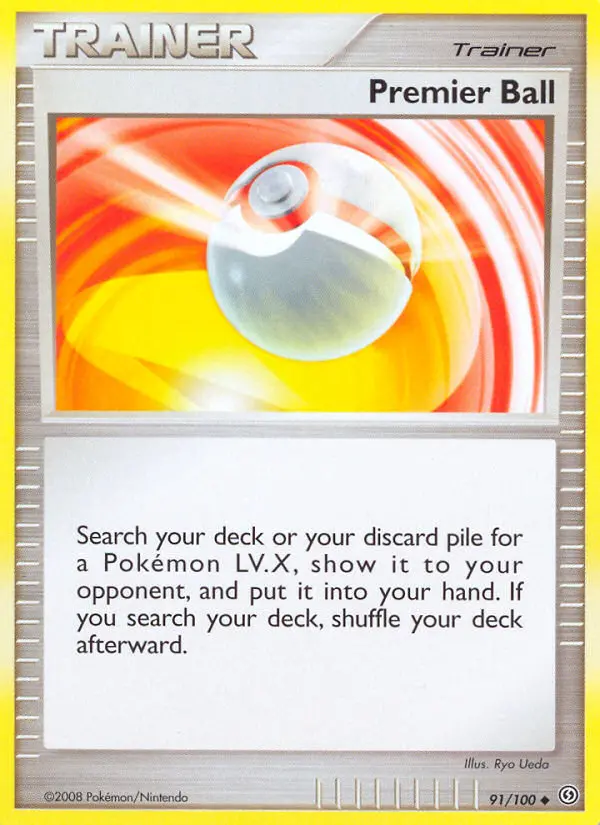
Premier Ball #91 — Stormfront
#91 Premier Ball
The illustration shows a Premier Ball in close-up, spinning fast enough to blur — the white shell and gold crown detail streaking against a bright, energetic background. It's a simple object rendered dynamically, and the tight framing gives it more visual impact than the subject might suggest. The print quality on DP-era item cards varies noticeably, and the white surface of the Premier Ball itself is the first place that shows print dot inconsistency or surface marking. White objects on white card stock are particularly unforgiving at PSA grading. As a common that lived in deck boxes rather than card sleeves, the copies in circulation accumulated wear from the first week after the set released, and the census has almost nothing to show for it.
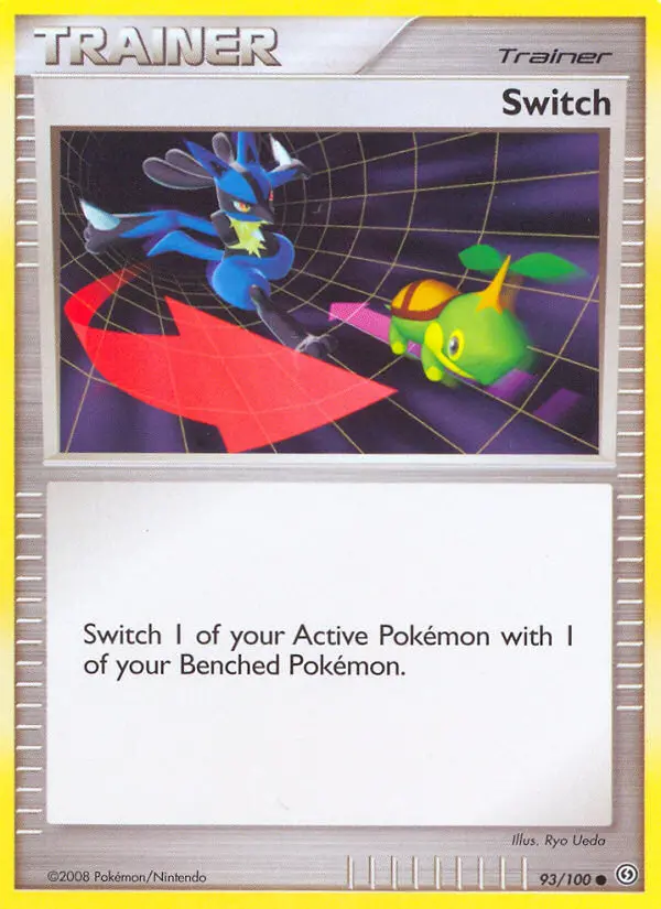
Switch #93 — Stormfront
#93 Switch
Ryo Ueda stages an unlikely pairing — Lucario in an aggressive forward stance swapping positions with a small, passive Budew, the contrast between the two Pokémon's scale and energy giving the illustration a wry visual humor. The composition is dynamic and well-considered for a card that could have just shown an arrow or a generic swap symbol. The white border and clean background mean that card stock quality and centering issues are immediately visible to graders — there's nowhere to hide. But the deeper reason for the low census is simpler: Switch is the most reprinted Trainer in TCG history. Copies from every era exist in bulk quantities. Nobody separates out a single Stormfront Switch and treats it as a collectible, because there are thousands more from other sets sitting in the same box.
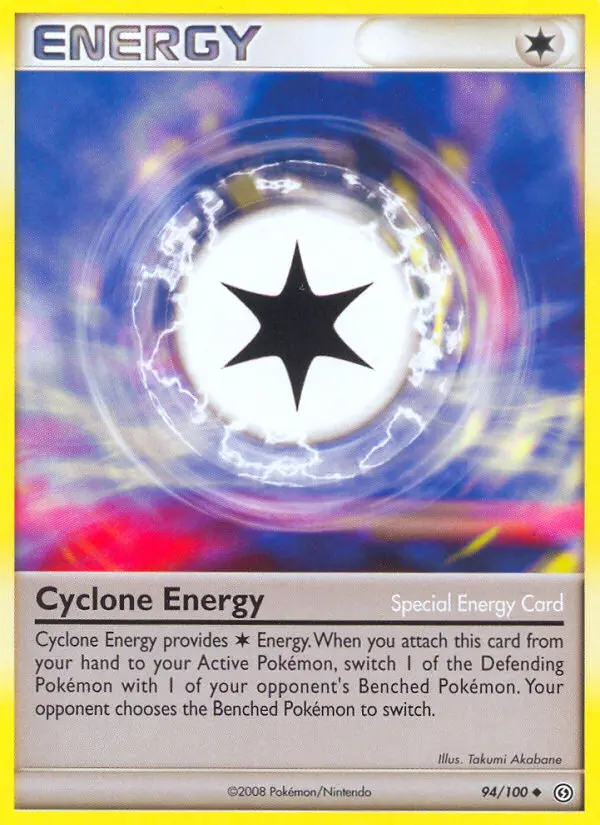
Cyclone Energy #94 — Stormfront special energy
#94 Cyclone Energy — Special Energy
Takumi Akabane renders Cyclone Energy as a swirling silver-blue vortex — pure abstract energy in motion, the kind of visual that suits the Special Energy card format well because there's nothing literal to depict. The spiral composition has real movement to it, the cool metallic tones fading from bright center to dark outer edge. Energy cards are among the most uniformly overlooked cards in any set from this era: they come out of packs in multiples, get sorted into energy boxes without sleeves, and are treated as craft supplies rather than collectibles. Special Energies with more visual interest than a basic energy still suffer the same fate — nobody grades their Cyclone Energy because nobody ever thought of their Cyclone Energy as something worth grading. The census being nearly empty is the expected outcome, not the surprising one.
Pack Prices Are Climbing — Know What You're Sitting On Before You Rip
Stormfront booster packs have been moving fast in the secondary market. Sealed packs that were sitting around $200 not long ago have pushed well past that, and the trajectory isn't flattening. The combination of Diamond & Pearl era kids growing up, a renewed interest in vintage sealed product, and the relative scarcity of late 2000s print runs is compressing supply faster than most collectors anticipated. If you're planning to rip a loose pack or are feeling wild enough to rip a booster box, understanding the population data before you crack anything open changes how you treat what comes out.
The low-pop cards on this list are the sleeper opportunity in a Stormfront rip. Reverse foil trainer cards like Poké Drawer+ (#89) and Marley's Request (#87) in a PSA 10 copy with a population of 1 occupies an entirely different market position than a bulk uncommon. With populations this thin, a single high-grade slab can command real money precisely because there's almost no competition from other graded copies. When the only PSA 10 on the market sells, the next one sets the new comp.